Project Type
Product Design
Client
TourRadar
Bringing Pricing Clarity to the Search Funnel

Introducing a traveller selector to surface accurate, personalised pricing earlier in the search funnel.
TourRadar is a travel marketplace that helps users discover and book group tours. The challenge was that travellers were not seeing accurate pricing during their search, only encountering the real total at checkout, creating frustration and drop-off, particularly among solo travellers who were unaware of mandatory single supplements until the very end of the funnel.
I was the design lead responsible for end-to-end research synthesis and final UX and UI design. I worked alongside the product manager, Alex. Together we owned the research process, pulling insights from user interviews, surveys, customer service data, and on-platform feedback widgets. And performed user testing with Alex to validate our concepts.
Design Approach
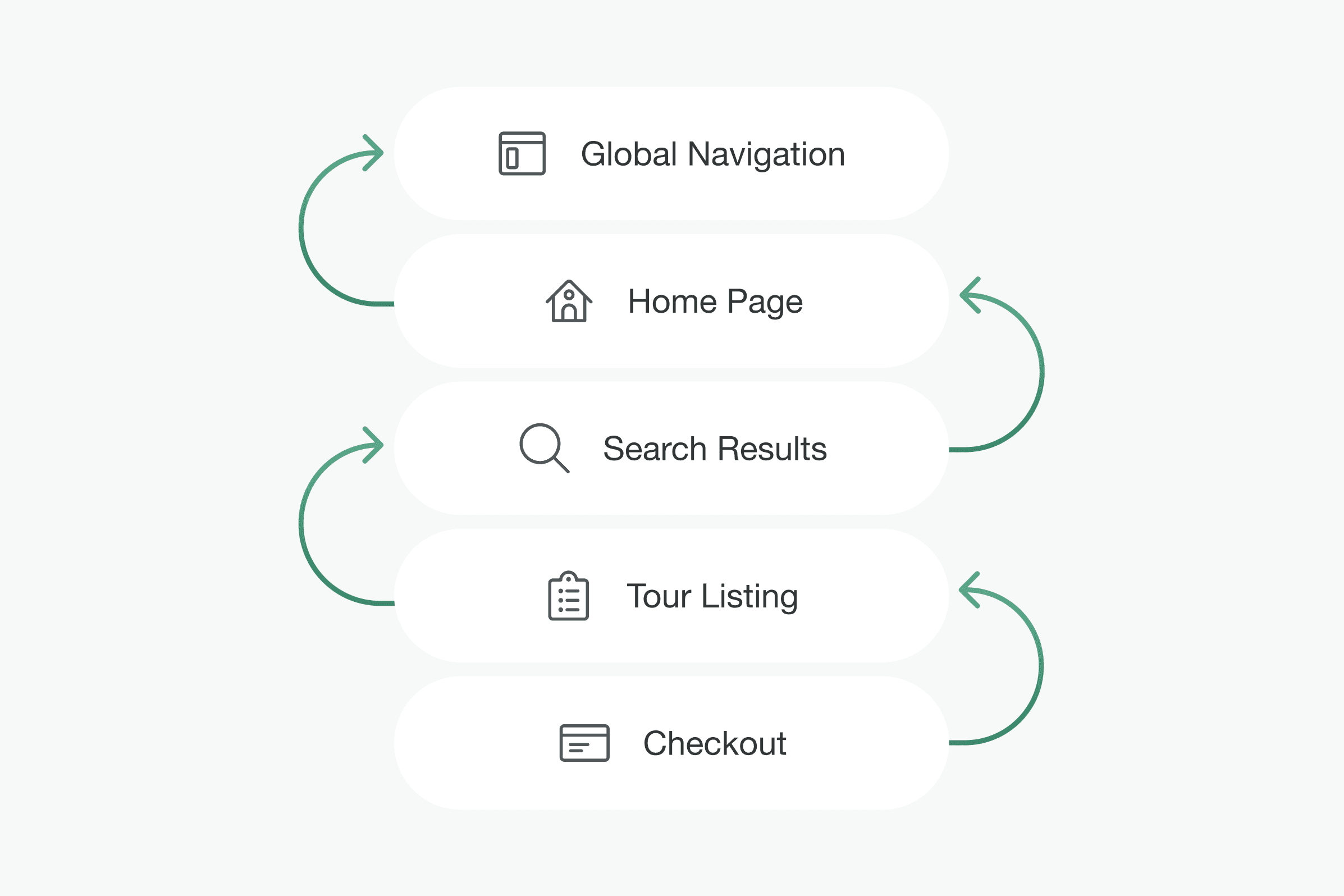
Phased rollout in reverse funnel order
Our tech lead flagged early that shipping this as a single release was too risky. Rather than delay the value, we broke the rollout into stages, starting where it was lowest effort and highest impact. A traveller selector already existed on checkout, so we extended it to the tour listing page first, then the search results page, then the homepage, and finally across the global navigation. This let us validate the pattern at each stage without overextending the team.
Persistent search bar across the entire journey
User research showed that people were navigating back to the homepage to modify their search. On mobile, especially, this was a significant friction point. I made the search bar permanently visible regardless of where a user was in the funnel, giving them a lightweight way to adjust their parameters, including traveller count, without losing their place.

Replacing Adventure Type with the Traveller selector in the search bar
The original search had three fields: Destination, Date, and Adventure Type. Usage data showed that Adventure Type was not a meaningful input for most users at the start of their search. I also knew from interaction data that drop-off increases significantly beyond three fields. Swapping Adventure Type for the Traveller selector kept the search bar lean while introducing the field that had the most direct impact on pricing accuracy.

Pricing on search results dynamically reflects traveller selection
Once the traveller count was captured upfront, we updated the pricing display on the search results page to show the best available price based on that selection. For solo travellers, this meant seeing the correct price, including any applicable single supplement, before ever reaching checkout. The right price, shown at the right moment.
